#100977: "Make activated abilities easier to see"
どうしましたか?以下から選んでください
どうしましたか?以下から選んでください
同一内容の報告がないか、ご確認ください
もしそうなら、このレポートに投票してください。投票の多いレポートから調査されます!
| # | Status | Votes | Game | Type | Title | Last update |
|---|
詳細
-
• もしあれば、画面に表示されたエラーメッセージをコピー&ペーストしてください
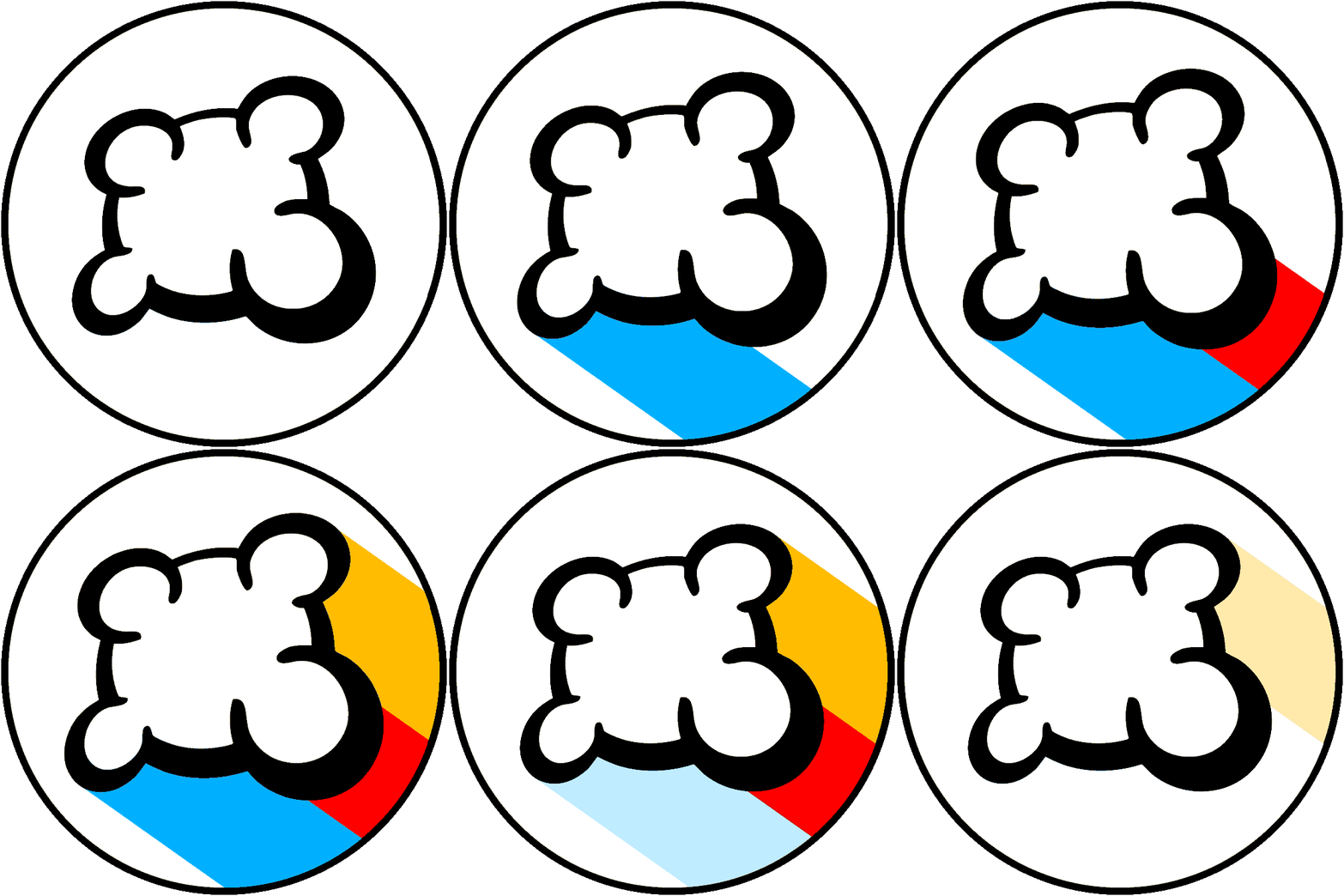
Currently, when a crop card is watered or fed, a token is placed on the card. But this token is exactly the same as the icon on the card, in exactly the same orientation, except slightly bigger and slightly shadowed. At a real table, this would probably be easier to see, but in an online implementation (with a straight top-down view), it can be hard to spot without looking carefully. (I have a big monitor - I can't imagine what it's like on a phone screen.)
The simplest solution I can think of would be to make the tokens solid colors (removing the icon).
Alternatively, maybe adding an additional mark on top of the token (like a big checkmark) would work.
-
• 何をしたいか、何をしたか、何が起きたかを説明してください
• あなたのブラウザは何ですか?
Google Chrome v117
-
• あなたの言語の代わりに、表示されている英語の文章をコピー&ペーストしてください。 このバグのスクリーンショットをお持ちの場合は、お好みの画像ホスティングサービス(例えば、 snipboard.io など)をご利用し、コピー&ペーストしたリンクをここに書き込んでください。 このテキストは翻訳ページで翻訳可能になっていますか?もしそうならば、24時間以上前に翻訳されていますか?
Currently, when a crop card is watered or fed, a token is placed on the card. But this token is exactly the same as the icon on the card, in exactly the same orientation, except slightly bigger and slightly shadowed. At a real table, this would probably be easier to see, but in an online implementation (with a straight top-down view), it can be hard to spot without looking carefully. (I have a big monitor - I can't imagine what it's like on a phone screen.)
The simplest solution I can think of would be to make the tokens solid colors (removing the icon).
Alternatively, maybe adding an additional mark on top of the token (like a big checkmark) would work.
• あなたのブラウザは何ですか?
Google Chrome v117
-
• 何を意味するのか、簡単に理解できるようにあなたの提案を正確かつ簡潔に説明してください。
Currently, when a crop card is watered or fed, a token is placed on the card. But this token is exactly the same as the icon on the card, in exactly the same orientation, except slightly bigger and slightly shadowed. At a real table, this would probably be easier to see, but in an online implementation (with a straight top-down view), it can be hard to spot without looking carefully. (I have a big monitor - I can't imagine what it's like on a phone screen.)
The simplest solution I can think of would be to make the tokens solid colors (removing the icon).
Alternatively, maybe adding an additional mark on top of the token (like a big checkmark) would work.
• あなたのブラウザは何ですか?
Google Chrome v117
-
• ブロックされたときの表示は何でしたか(空のスクリーン?一部のみのゲームインターフェイス?エラーメッセージ?)
Currently, when a crop card is watered or fed, a token is placed on the card. But this token is exactly the same as the icon on the card, in exactly the same orientation, except slightly bigger and slightly shadowed. At a real table, this would probably be easier to see, but in an online implementation (with a straight top-down view), it can be hard to spot without looking carefully. (I have a big monitor - I can't imagine what it's like on a phone screen.)
The simplest solution I can think of would be to make the tokens solid colors (removing the icon).
Alternatively, maybe adding an additional mark on top of the token (like a big checkmark) would work.
• あなたのブラウザは何ですか?
Google Chrome v117
-
• BGAで正しく実装されていないルールはどの部分ですか?
Currently, when a crop card is watered or fed, a token is placed on the card. But this token is exactly the same as the icon on the card, in exactly the same orientation, except slightly bigger and slightly shadowed. At a real table, this would probably be easier to see, but in an online implementation (with a straight top-down view), it can be hard to spot without looking carefully. (I have a big monitor - I can't imagine what it's like on a phone screen.)
The simplest solution I can think of would be to make the tokens solid colors (removing the icon).
Alternatively, maybe adding an additional mark on top of the token (like a big checkmark) would work.
-
• ルールの間違いはゲームのリプレイで確認できますか?そうであれば、行動番号は何番ですか?
• あなたのブラウザは何ですか?
Google Chrome v117
-
• やりたかったゲームアクションは何ですか?
Currently, when a crop card is watered or fed, a token is placed on the card. But this token is exactly the same as the icon on the card, in exactly the same orientation, except slightly bigger and slightly shadowed. At a real table, this would probably be easier to see, but in an online implementation (with a straight top-down view), it can be hard to spot without looking carefully. (I have a big monitor - I can't imagine what it's like on a phone screen.)
The simplest solution I can think of would be to make the tokens solid colors (removing the icon).
Alternatively, maybe adding an additional mark on top of the token (like a big checkmark) would work.
-
• このゲームアクションを引き起こす為に何を試みましたか?
-
• これを行おうとしたときに何が起こりましたか?(エラーメッセージ、ステータスバーメッセージ、他)
• あなたのブラウザは何ですか?
Google Chrome v117
-
• どの段階でこの問題が起こりましたか?(画面の指示はどうなっていましたか)
Currently, when a crop card is watered or fed, a token is placed on the card. But this token is exactly the same as the icon on the card, in exactly the same orientation, except slightly bigger and slightly shadowed. At a real table, this would probably be easier to see, but in an online implementation (with a straight top-down view), it can be hard to spot without looking carefully. (I have a big monitor - I can't imagine what it's like on a phone screen.)
The simplest solution I can think of would be to make the tokens solid colors (removing the icon).
Alternatively, maybe adding an additional mark on top of the token (like a big checkmark) would work.
-
• ゲームアクションを行おうとしたとき、何が起こりましたか?(エラーメッセージ、ステータスバーメッセージ、他)
• あなたのブラウザは何ですか?
Google Chrome v117
-
• 表示の問題を説明してください このバグのスクリーンショットをお持ちの場合は、お好みの画像ホスティングサービス(例えば、 snipboard.io など)をご利用し、コピー&ペーストしたリンクをここに書き込んでください。
Currently, when a crop card is watered or fed, a token is placed on the card. But this token is exactly the same as the icon on the card, in exactly the same orientation, except slightly bigger and slightly shadowed. At a real table, this would probably be easier to see, but in an online implementation (with a straight top-down view), it can be hard to spot without looking carefully. (I have a big monitor - I can't imagine what it's like on a phone screen.)
The simplest solution I can think of would be to make the tokens solid colors (removing the icon).
Alternatively, maybe adding an additional mark on top of the token (like a big checkmark) would work.
• あなたのブラウザは何ですか?
Google Chrome v117
-
• あなたの言語の代わりに、表示されている英語の文章をコピー&ペーストしてください。 このバグのスクリーンショットをお持ちの場合は、お好みの画像ホスティングサービス(例えば、 snipboard.io など)をご利用し、コピー&ペーストしたリンクをここに書き込んでください。 このテキストは翻訳ページで翻訳可能になっていますか?もしそうならば、24時間以上前に翻訳されていますか?
Currently, when a crop card is watered or fed, a token is placed on the card. But this token is exactly the same as the icon on the card, in exactly the same orientation, except slightly bigger and slightly shadowed. At a real table, this would probably be easier to see, but in an online implementation (with a straight top-down view), it can be hard to spot without looking carefully. (I have a big monitor - I can't imagine what it's like on a phone screen.)
The simplest solution I can think of would be to make the tokens solid colors (removing the icon).
Alternatively, maybe adding an additional mark on top of the token (like a big checkmark) would work.
• あなたのブラウザは何ですか?
Google Chrome v117
-
• 何を意味するのか、簡単に理解できるようにあなたの提案を正確かつ簡潔に説明してください。
Currently, when a crop card is watered or fed, a token is placed on the card. But this token is exactly the same as the icon on the card, in exactly the same orientation, except slightly bigger and slightly shadowed. At a real table, this would probably be easier to see, but in an online implementation (with a straight top-down view), it can be hard to spot without looking carefully. (I have a big monitor - I can't imagine what it's like on a phone screen.)
The simplest solution I can think of would be to make the tokens solid colors (removing the icon).
Alternatively, maybe adding an additional mark on top of the token (like a big checkmark) would work.
• あなたのブラウザは何ですか?
Google Chrome v117
報告履歴
I think it's important that the markers be recognisable as resource tokens, because the supply of tokens is limited and gets depleted throughout the game as they get used as markers. So I wouldn't want to change or obscure the appearance of the token. Something I had considered is changing the white background. We're considering options.
報告に書き加える
- 他のテーブルID/行動ID
- F5キー(ページの再読込)で問題は解決されましたか?
- 問題は何回も起こりましたか?毎回 起こりますか?ランダムに起きますか?
- このバグのスクリーンショットをお持ちの場合は、お好みの画像ホスティングサービス(例えば、 snipboard.io など)をご利用し、コピー&ペーストしたリンクをここに書き込んでください。

